Digital Menu Setup
Topic 06
Mobile layout checks before you share
QA on a real phone
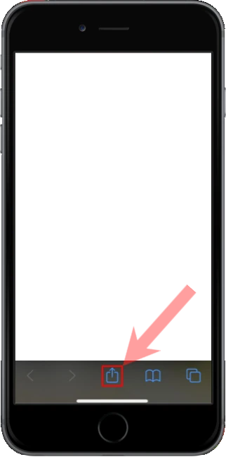
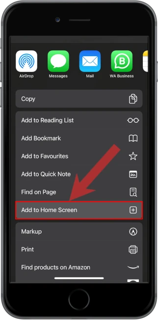
Open your menu on a phone every time you publish. Broken images, endless categories, and missing buttons show up there first.
In 30 seconds
- Open the public link on your phone, not only a desktop.
- Tap WhatsApp, Phone, and a top dish.
- Fix anything that needs pinch-zoom or guesswork.
Why this matters
A quick visual for busy owners.Replace with a real Menu item editor with photo and price screenshot when ready.Most diners never see your desktop preview. If mobile is clumsy, your marketing traffic converts into frustration.
Five-minute mobile QA
- Home loads fast enough to use
- Categories are readable
- Images load
- Prices visible without hunting
- Contact actions work
Example
7 days
30 days
90 days
Visitors · Device mix
- Mobile share91%
- Desktop share9%
- Menu views612
- Quick exitsWatch after big edits
Recommendation
Phone first, alwaysWith most traffic on mobile, never share a change you have not tapped on a handset.
Data to decisions
| What you notice | What to do |
|---|
| Quick exits after a redesign | Undo clutter; restore clear categories |
| Images fail on cellular | Compress and re-upload |
| Contact button hard to reach | Keep actions easy on small screens |
The takeaway
Your phone is the real editor preview. Use it before every share.